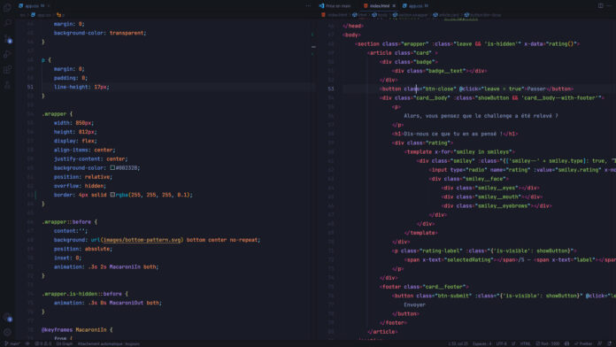
Code In the dark: BastiUI rating system
I offer you today a small summary of the challenge which was organized by BastiUI and Benjamin Code. This challenge is a code in The Dark where the objective is to code without being able to watch the rendering.
For this challenge, BastiUI took care of the model, letting subscribers choose the visual styles. So we end up with a notation system in mode obscure who uses the style neo-memphis with a rating system based on animated smileys. The model was made on figma and a prototype system allows you to see the animations designed for the different elements. The main difficulty of this challenge is based on the creation of these animated smileys because there are particular elements such as the mouth or the eyebrows which will require precise positioning, which is not necessarily obvious without having the right to use the rendering .
I invite you to try this challenge before watching the video. It’s a good way to practice HTML/CSS.
This challenge is interesting because it allows us to put into practice what we know and to question our knowledge since we cannot rely on the rendering. We are forced to base ourselves on what we know about the properties and their effects. In my case, here are the small details that I was able to retain from this challenge:
- A transparent border lets the background color of the element show through rather than creating a gap that would allow the background color of the elements below to be seen
- To create a double border effect, rely on a double
box-shadowis simpler than using 2 pseudo elements. - A pseudo element with a
z-indexto-1will appear under the current element (including under the background). On the other hand, if we use aisolation: isolateon the parent element then the pseudo element will be above the background of the parent element.
For the most curious among you, here is the result obtained at the different stages of the challenge on CodeSandbox


