
Float, Flex or Grid? — CSS Discovery Training
In this tutorial we will take stock of the different methods of placing elements and their use cases.
float
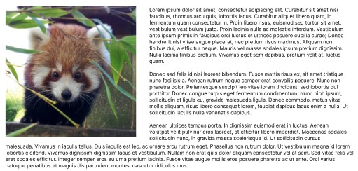
The use of float:left allows you to remove an element from the normal flow and will only be used today to place an element on the left or on the right with the other “inline” elements that are placed around it (illustration image in an article for example).
Flex
the display:flex allows you to change the layout of the elements with row or column positioning. The child elements of a Flexbox are then responsible for setting their width/height via properties width/height and through the flex-basis.
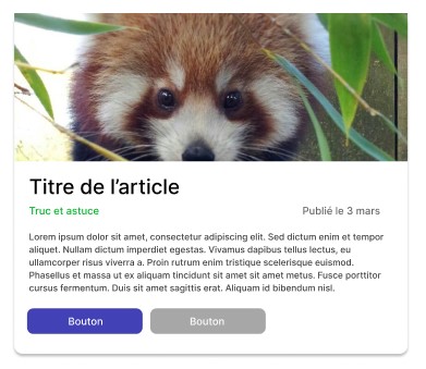
The approach flexbox is therefore useful for changing the direction of placement of elements (for example to place them next to each other) without necessarily having precise dimensions for children. We will therefore tend to use them in the following cases:
- We want to align the elements vertically or horizontally by inserting a space with the property
gap. - We have a grid that is not uniform (column structure that varies between each line).
Grid
The main feature of display: grid is the fact that the parent element has the responsibility of defining the structure via a grid-template-columns Where grid-template-rows. This avoids having to add rules on child elements.
Typically, as the name suggests, this type of positioning is very suitable for a grid layout

.grid {
    display: grid;
    gap: 10px;
    grid-template-columns: repeat(5, 1fr);
}
You can also easily create a responsive structure that adapts the number of elements according to the desired width for the elements
.grid {
    display: grid;
    gap: 10px;
    grid-template-columns: repeat(auto-fit, minmax(250px, 1fr));
}
You can also use this type of layout to create page structures quickly thanks in particular to the grid-area.
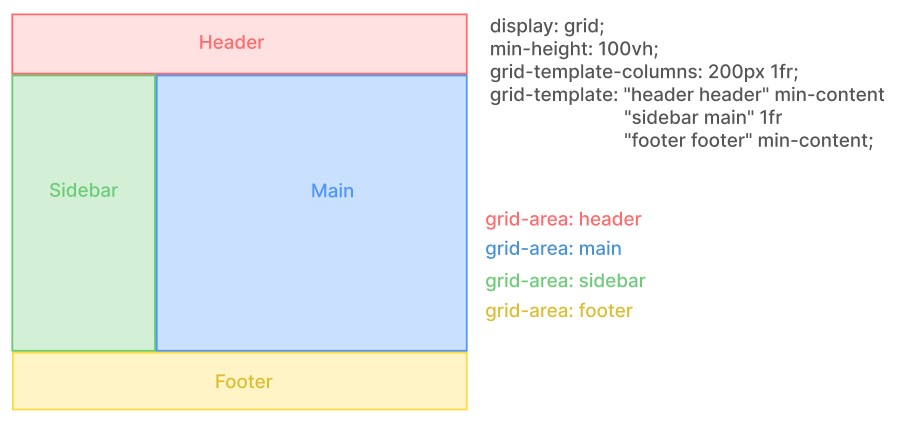
<style>
.layout {
    display: grid;
    min-height: 100vh;
    grid-template: "header header" min-content
                    "sidebar main" 1fr
                    "footer footer" min-content;
    grid-template-columns: 250px 1fr;
}
header {
    grid-area: header;
}
aside {
    grid-area: sidebar;
}
main {
    grid-area: main;
}
footer {
    grid-area: footer;
}
</style>
<div class="layout">
    <header>Header</header>
    <aside>Sidebar</aside>
    <main>Contenu</main>
    <footer>Footer</footer>
</div>
This approach makes it easy to drive the structure from the parent element .layout by changing the template via the property grid-template. This type of positioning is therefore interesting for the following cases:
- We want to use a simple grid
- We want to create a structure that can be broken down into columns (constant between each line).


 — Formation Symfony 7")


 — Formation Symfony 7")
 — Formation Symfony 7")
