How to manage actions?
I propose today to look at a recurring ergonomic problem: the placement of actions related to a content.
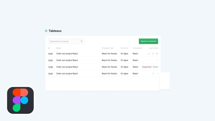
For this example, we will imagine working on the administration of tutorials on Grafikart. The administration presents the whole tutorial in a table and we want for each tutorial to have access to modification, deletion and duplication operations.
A list of icons
The first approach is to use an icon list that will represent the different actions. This approach is interesting but may be problematic in some situations.
- Understanding the icons is not necessarily easy. The same icon will not necessarily have the same meaning depending on the context and it is not always easy to understand the actions associated with certain icons. For example, which icon will be used to represent the action "duplicate" or "archive"?
- The space available on small screens is limited, and the space allocated to actions may be too large in the case of too many actions.
Simple labels
This is the first solution we generally think about. Simple labels "edit" or "delete" (we can embellish this label of a particular color code such as red for deletion for example) can sometimes do the trick. They solve the problem of understanding, but just like our series of icons the problem of the place will remain. We will reserve this solution if we have a very small number of actions or we do not necessarily have specific icons.
The drop-down menu "kebab menu"
Another approach is to put all of our actions in a drop-down menu available via a simple "action" button or via a kebab-menu (this icon is relatively widespread today and is easily recognizable by users). this approach makes it possible to remedy the two problems mentioned above.
- The drop-down menu allows you to put actions in words, which avoids comprehension problems.
It also solves the problem of space since a single icon can now give access to a greater number of actions.
On the other hand, the use of such a menu adds an extra step for access to current operations. This extra friction can be frustrating for the user. This approach will be reserved for actions that are used less frequently by the user. For our example, the removal of a tutorial as well as the duplication could be placed in such a menu.
Combining solutions
Finally, do not hesitate to mix the different methods according to the expectations of users. It is for example possible to highlight the most useful actions via direct access (either by icons or by labels), while placing the secondary actions in a drop-down menu.
In the same way, this mixture of solutions can make your interface responsive. The actions are placed in adjacent ways by default, but combine in a kebab-menu when the place runs out on small screens.


