UI / UX Video Tutorial: Design Review # 2
For this new video devoted to the design review, I suggest you watch 2 new designs. These 2 designs are interesting because they are finished products corresponding to 2 very distinct types of projects.
Showcase site"
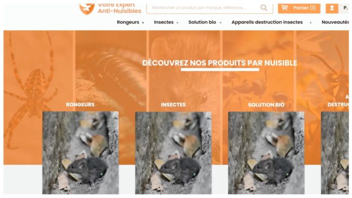
The first site that we will look at is a site for the sale of services / products related to the fight against pests. It is an interesting project because it poses an important challenge in terms of communication. How to communicate on the effectiveness of products and services without using images that could have a negative perception on the part of users.
CRM
The second design that we will analyze is a dashboard allowing the processing of information. The main problem when designing a CRM and you tend to want to make a maximum of functionalities accessible (by making the interface more complex than necessary). It is important to analyze the business needs in order to highlight the most frequently used actions and to simplify the general appearance of the product. It is possible, for example, to hide certain infrequent operations behind them in order to improve the process of using the application. However, this cannot be done without a very good understanding of the business logic of the application.


