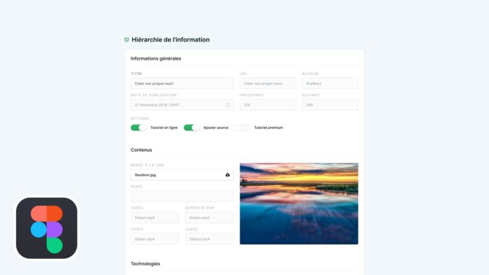
UI / UX Video Tutorial: Information Hierarchy
Today we are going to discuss the hierarchy of information. A design is not just a pretty page and it is important to think about the structure of the information and the ergonomics of the interface.
Listen to the user
Do not embark on the creation of an interface without asking yourself the question before using it. Users will not necessarily have the same needs and it is important to think of an interface so that it allows the user to reach his goal easily. It will therefore be necessary to reflect with the client on the needs and the business logic before embarking on the creation of a model.
- What element should be highlighted?
- What information is most important?
- What action do you use most often?
These questions will also allow you to think upstream about the hierarchy of information and to design a product that is more in line with user expectations.
Be consistent
The second important point is to be homogeneous in terms of spacing / placement. At the first glance, the person will quickly scan the structure of the interface and it is important to guide it to better identify the important elements.
We will choose a spacing with a specific ratio and we will adapt the amount of space according to the context. For example, a space based on an 8px grid gives good results. We can multiply by 2 for the spacing between 2 elements of the same context (16px) and by 3 or 4 for elements of different context (24 to 32px).
Think about the direction of reading, while considering the need
By default, users on the web tend to read information using a pattern of F. The user begins by reading the first line and then looks slightly below to read more, systematically returning to the left. But this reason is not necessarily a golden rule that you must adopt in 100% of the cases. According to the objectives of the users the method and the direction of reading can change:
- If a user goes through a list of similar products he will tend to look at each product meticulously before moving on to the next product.
- If a user searches for a specific product from a list, his gaze will scan the page more quickly in search of a strong visual cue (product or visual title).
As stated at the beginning of the article, it is therefore important to understand the need in order to make the right decision when choosing the presentation.
- If the user does not know exactly which product to choose, showing him more information on the characteristics of the products can be an important help in his choice.
- If the user is looking for a specific product, reducing visual noise and highlighting only important information (visual and title) will be more suitable.


