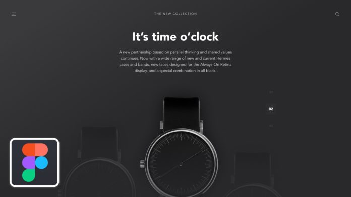
UI / UX Video Tutorial: White spaces
In this video I suggest you talk together about “white space” in web design.
For the text
Line height
The use of space in texts is important because it improves reading comfort.
Text lines that are too close together make it more difficult for the user to read a line. Conversely too spaced lines make the text disjointed. Also it is important to use a suitable line height for the display of text block with a value between 120% and 160% of the line height (it will be necessary to adapt according to the basic font size and the font used ).
However, this value will not necessarily have to be applied systematically. As part of a title, which will be larger than the rest of the elements, we will tend to use a smaller line height (110% for example).
alignment
Text alignment can also be used to convey a different message. For example, a centered text can allow to put forward a line of text (for a title or a slogan for example) but we will avoid this alignment for blocks of content (the reading of several centered line is not very natural) .
Also, a centered text makes it more difficult to quickly scan the page. So the choice of such an alignment must therefore be well thought out and depend on your situation. You can also use other visual elements to balance the spaces (an image below your title / slogan for example).
Be consistent
We repeat ourselves a little more compared to the previous video but consistency is important because the brain relies on rules to quickly analyze the content. If you set a specific space to separate two blocks, keep this value on the whole of your application. Also, spaces must grow based on the types of content they separate.
Two paragraphs will be more spaced with a space equivalent to the line height. However, a second level title will have a top margin to mark a new section and will allow the user to unconsciously separate the context.
Space = Quality
Finally, you should know that, unconsciously, our brain associates the use of space with a notion of quality. If we make an analogy with the real world, when we go to a luxury store the products will be spaced from each other and the store will offer significant circulation spaces. Conversely, a store that disposes of things in bulk will give an impression of inferior quality (but also an impression of overabundance).
This space feeling can be used to your advantage. If you create a site for a luxury brand for example, we will tend to create pages with a lot of white space, which will give the user an impression of luxury and quality (we can observe this visual language on the Apple site). Conversely if we design a general e-commerce, we will tend to bring the elements closer together to give an impression of abundance and more attractive prices.


